Re-Imagining Backpack
The project was initiated during fall 2020 and the scope was to re-design the internal LMS (Backpack) at Tre, to make it more modern, and fix its “many issues”, as well as building a foundation for the future where the system could evolve, and accommodate for new organizational goals over time as they were developed.
First things first
I kicked off the project by doing semi-structured user interviews with the purpose to find out the main pain points from the perspective of employees from different parts (and in different positions) of the organisation. In total, 11 employees participated, and apart from being from different parts of the organisation, they were selected based on their engagement in the system (high or low).
When all was said and done, I carried through a combination of interpretative and descriptive analysis on the source material, and one apparent finding was that the users who belonged to the less engaged group were more inclined to state that the system was good as it was. Following upon that I decided to not divide the users based on engagement, and instead only focused on which parts of the organisation they came from.
The following were found:
- Users working in Stores value a good mobile experience, as they don’t always have access to computers. Users working from the office don’t mind, as they rarely ever use the mobile version.
- Navigating the system is confusing for some of the participants.
- Most of the participants experience a lack of communication from the system, in regards to new courses and other content.
- Most of the participants note that the organization lacks in communicating new features, and as such that they become hard to use and understand in the right wave.
- Some of the participants in managerial positions note that the team management features are lackluster, and they would like to be able to see course results from team members in an easier fashion.
- Some of the participants note that there is sometimes ambiguity in the language used, where one language is used for navigation and another for content.
- Few of the participants note that users aren’t always getting access to the right content in the system.
- Few of the participants note that it would be good if more content could be included in the LMS, so that all information can be found in one place.
- Few of the participants note that they would like to create their own content in the LMS.
A few words on Administrators
While the primary user of a system like this is the regular co-worker, another important user group is the administrators – in this case, me and my colleagues. Some of our pain points were:
- Users not getting access to the right content, and as such demanding manual labour from us to fix what was intended to “just work”.
- Having to create manual reports for the organization due to the complexity for managers to create such reports on their own.
To make the final prioritization, the user pain points and needs were combined with the administrator pain points, and finally weighed towards the number of occurrences. Which yielded the following design goals:
- Making it possible for users to see what’s new, no matter if they are on mobile or desktop.
- Simplifying navigation.
- Simplifying team management and report taking for managers.
While noting that the following has to be remedied outside of the design to make for as good of a user experience as possible:
- Improving our internal processes, so that users end up in the right places in the system.
- Getting better at communicating new features and how to use them.
Instant Hi-Fi
As the scope was to improve on an existing system (as opposed to creating something entirely new), and time and budgets were limited, I moved into hi fi-prototyping quite early on, and used the already existing underlying grids of Backpack as baseline, while improving the layout and the details within those boundaries to better accommodate the users.
To give you a rough idea of what we had to work with, here’s a picture of the dashboard from my own user:
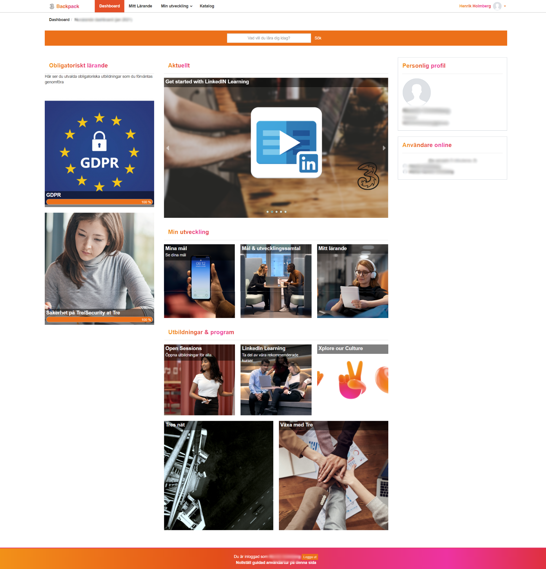
This design only serves static, predefined content to the user, and this dashboard doesn’t help the user in showing what has happened lately. There are no visual hierarchies guiding the user what is important – here, everything (nothing) is important, which could explain why users have issues navigating the system.
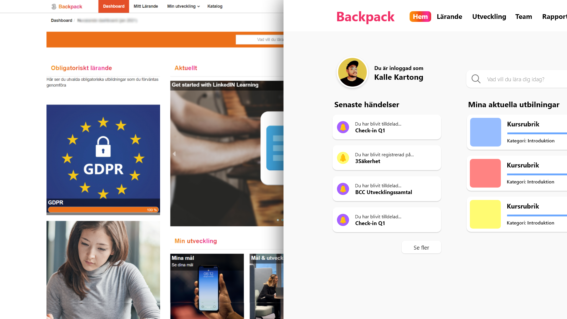
To “solve” these issues (the primary issues derived from the user interviews), I went with something like this:
The intention was to serve only current content at the dashboard, which would drive the user to use the “learning”, and “performance” pages when they needed to delve deeper (instead of trying to serve all available content on the dashboard). The mobile version would render with the left row first, which would allow users in Stores to see “what’s new” first.
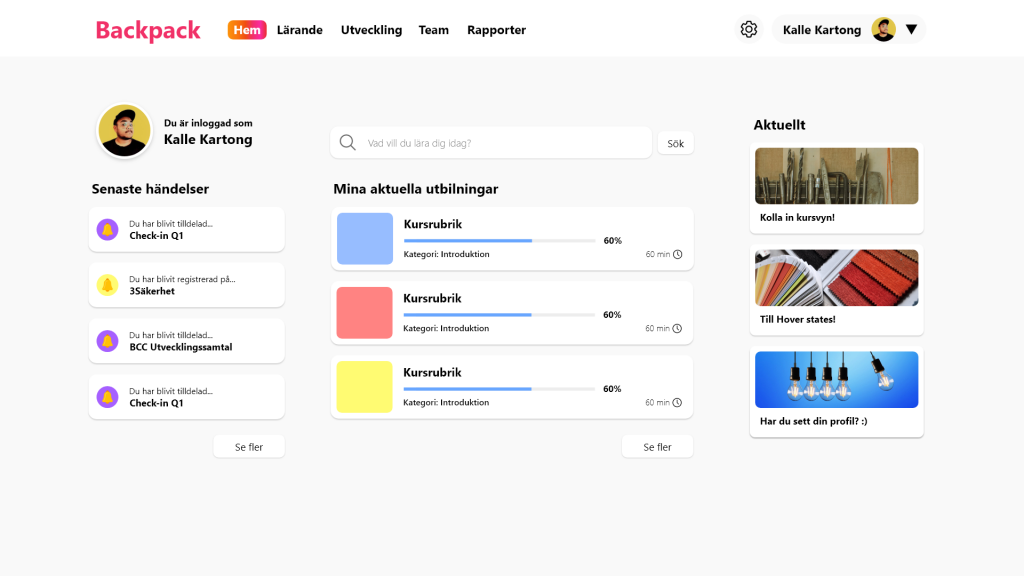
Below you can see the first iteration of what you see above:
The process of getting from A to B, was basically moving back and forth between different parts of the design, letting it grow into a component-based design system, while taking in feedback from stakeholders.
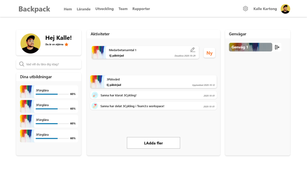
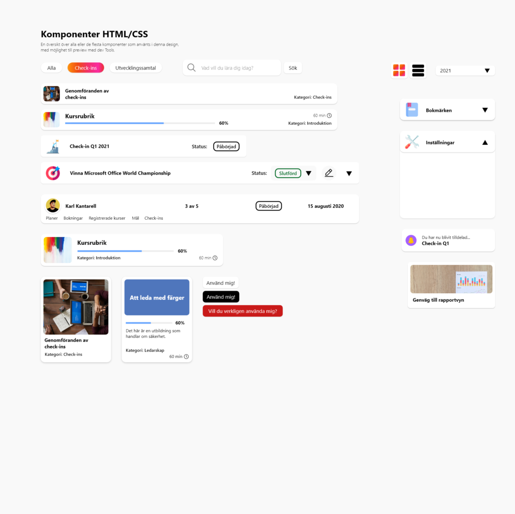
Here you can see all of the base components of the design:
The result
The result was a fully interactive prototype, covering most available views in the system. Needless to say, there is a lot more to show, and those who want me to show more, may feel free to reach out about that, as some parts of the prototype can’t be shown to the public. The design was never fully implemented, due to some undisclosed events out of Tre’s control, but the prototype has been used to further improve the current system, and will be used at Tre moving forward with new projects.